3. Introduction to ggplot
Motivating scenario: you have a fresh new data set and want to check it out. How do you go about looking into it?
Learning goals: By the end of this chapter you should be able to
- Know why we make plots.
- Connect your plotting ideas to your biological motivation.
- Build and save a simple ggplot.
- Explain the idea of mapping data onto aesthetics, and the use of different geoms.
- Match common plots to common data types.
- Use geoms in ggplot to generate the common plots (above).
Always visualize your data.
Anscombe’s quartet famously displays four data sets with identical summary statistics but very different interpretations (Figure 1, Table 1). The key lesson from Anscombe’s quartet is that statistical summaries can miss the story in our data, and therefore must be accompanied by clear visualization of patterns in the data.
| dataset | sd.x | sd.y | cor | mean.x | mean.y |
|---|---|---|---|---|---|
| 1 | 3.32 | 2.03 | 0.82 | 9 | 7.5 |
| 2 | 3.32 | 2.03 | 0.82 | 9 | 7.5 |
| 3 | 3.32 | 2.03 | 0.82 | 9 | 7.5 |
| 4 | 3.32 | 2.03 | 0.82 | 9 | 7.5 |
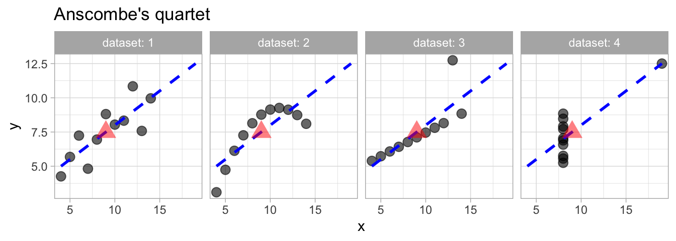
Therefore before diving into formal analysis, we always generate exploratory plots to uncover key patterns, detect data quality issues, and reveal the underlying structure of the data. One quick exploratory plot is rarely enough though, as you get to know and model your data, you will develop additional visualizations to dig deeper into the story.
Ultimately, after a combination of exploratory plots, summary statistics, and statistical modelling has helped you understand the data, you will generate well-crafted explanatory plots to communicate your insight elegantly to your audience. We will focus on the process of making explanatory plots in a later chapter.
Detect data quality issues early It is common to split up data collect to a team and maybe someone enters data in centimeters, and someone else in inches (etc). Or maybe for a data point or two a decimal point was lost, a value is way bigger than it should be. Everytime you collect and enter data you should make some plots to help identify any such data issues.
Focus on biological questions.
Before starting your R coding, consider the plots you want to make and why. It is all too easy to get stuck in the R vortex—making plots simply because they’re easy to create, visually appealing, fun, or challenging, and before you know it you’ve wasted an hour doing something that did not move your analysis or understanding forward. So before make a (set of) plot(s) always consider
- The thing you want to know, and how it relates to the motivating biology. This includes
- Identifying explanatory and response variables, and
- Distinguishing between key explanatory variables from covariates that you may not care about but need to include.
- That the visualization of data reflects your biological motivation.This is particularly tricky for categorical variables which R loves to put in alphabetical order but may likely have a reasonable order to highlight patterns or biology.
For the Clarkia RIL datasets:.
We primarily want to know which (if any) phenotypes influence the amount of pollinator visitation and hybrid seed formation.
- Our response variables are hybrid seed production and pollinator visitation (and perhaps we would like to know the extent to which pollinator visitation predicts the proportion of hybrid seed).
- Our explanatory variables that we care a lot about include: petal area, petal color, herkogamy, protandry etc… We also want to account for differences in the location of the experiment, even though this is not motivating our study.
- We also may want to evaluate the extent to which correlation between traits were broken up as we made the RILs. If trait correlations persists in the RILs it means that we cannot fully dissect the contribution of each trait to the outcome we care about, and that the genetic and/or physiological linkage between traits may have prevented evolution from acting independently on these traits.
- In this case there is not a natural order to our categorical variables, so we do not need to think too hard about that.
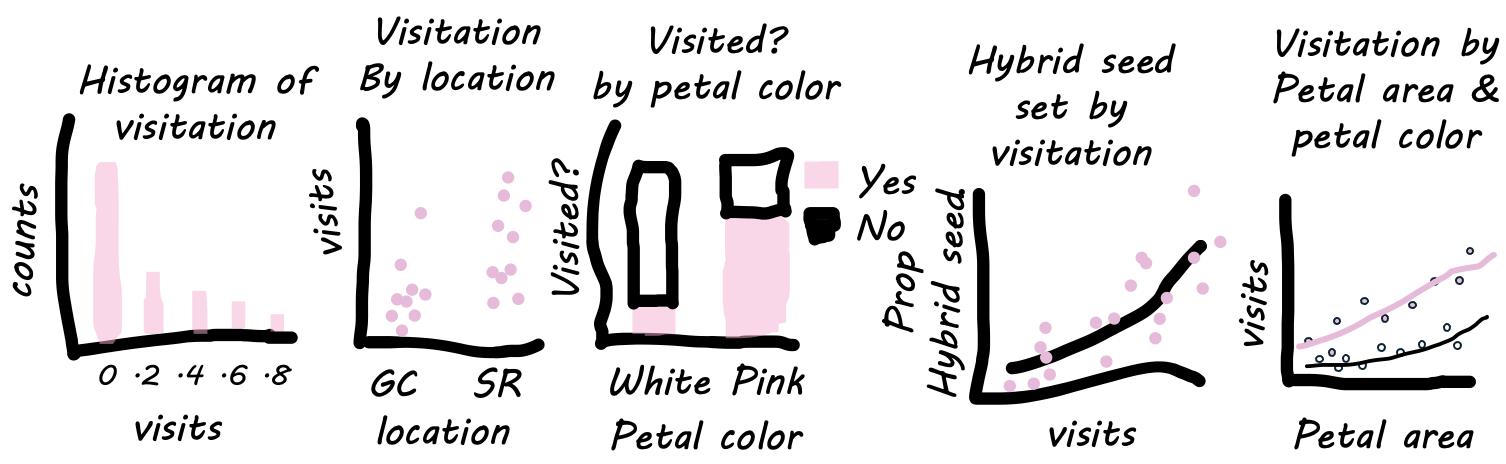
Let’s sketch some potential plots to address these questions.
I recommend sketching out what you want your plot to look like and what alternative results would look like (Figure 2). This helps to ensure that you are making the plot you want, not the one R gives you. In this case, some potentially important questions are:
- What is the distribution of the number of pollinator visits?
- Do we see different visitation by location?
- Are pink flowers more likely to be visited than white flowers?
- How does the number of visits change with petal area, and does this depend on petal color?
- Does pollinator visitation predict hybridization rate?
See Figure 3 for examples of how these may look.
The idea of ggplot
As described in the video above ggplot is based on the grammar of graphics, a framework for constructing plots by mapping data to visual aesthetics.. A major idea here is that plots are made up of data that we map onto aesthetic attributes, and that we build up plots layer by layer.
Let’s unpack this sentence, because there’s a lot there. Say we wanted to make a very simple plot e.g. observations for categorical data, or a simple histogram for a single continuous variable. Here we are mapping this variable onto a single aesthetic attribute – the x-axis.
We are using the ggplot2 package to make plots.
If you do not have ggplot2 installed, type:
install.packages("ggplot2") # Do this the 1st time!If you have ggplot2 installed or you just installed it, every time you start a new R session you still need to enter
library(ggplot2)Show code to load and format the data set, so we are where we left off.
library(readr)
library(dplyr)
library(ggplot2)
ril_link <- "https://raw.githubusercontent.com/ybrandvain/datasets/refs/heads/master/clarkia_rils.csv"
ril_data <- readr::read_csv(ril_link)|>
  dplyr::select(location,  ril, prop_hybrid,  mean_visits,
                petal_color, petal_area_mm,  asd_mm)|>
  dplyr::mutate(visited = mean_visits > 0)
Making ggplots:
The following sections show how to make plots that:
- Visualize the distribution of a single continuous variable.
- Saving a ggplot.
- Compare a continuous variable for different categorical variables.
- Visualize associations between two categorical variables.
- Visualize associations between two continuous variables.
- Visualize multiple explanatory variables.
Then we summarize the chapter, present practice questions, a glossary, a review of R functions and R packages introduced, and present additional resources.
Finally, for the true aficionados, I introduce ggplotly as a great way to get to know your data.