Figure 1: Generalist bees visiting another Clarkia species. From The sunmonsters Instaggam. See their post here.
Motivating Scenario:
You are continuing your exploration of a fresh new dataset. You have figured out the shape, made the transformations you thought appropriate, and now want to summarize associations between a categorical and a numeric variable.
Learning Goals: By the end of this subchapter, you should be able to:
Calculate and explain conditional means: You should be able to do this with basic math and with R code.
Calculate and explain Cohen’s D as a measure of effect size. In addition to being able to calculate Cohen’s D, you should be able to distinguish between “large” and small “effect sizes”.
Visualize differences between means:
We might expect that parviflora plants known to have attracted a pollinator would produce more hybrid seeds than those that were not. After all, pollen must be transferred for hybridization to occur, and visits from pollinators are the main way this happens. That seems biologically reasonable — but in statistics, such expectations must be tested with actual data.
In this section, we explore how to visualize and quantify associations between a categorical explanatory variable (e.g., whether a plant was visited by a pollinator) and a numeric response variable (e.g., the proportion of that plant’s seeds that are hybrids). We’ll see how group means and other summaries can reveal patterns in the data — and how to interpret what those patterns might mean biologically.
Summarizing associations: Difference in conditional means
In statistics, we often differentiate between a
Grand mean: The overall mean of a variable. and the
Conditional mean: The mean of one variable given the value of one (or more) other variables. With a single categorical variable, this is simply the group means.
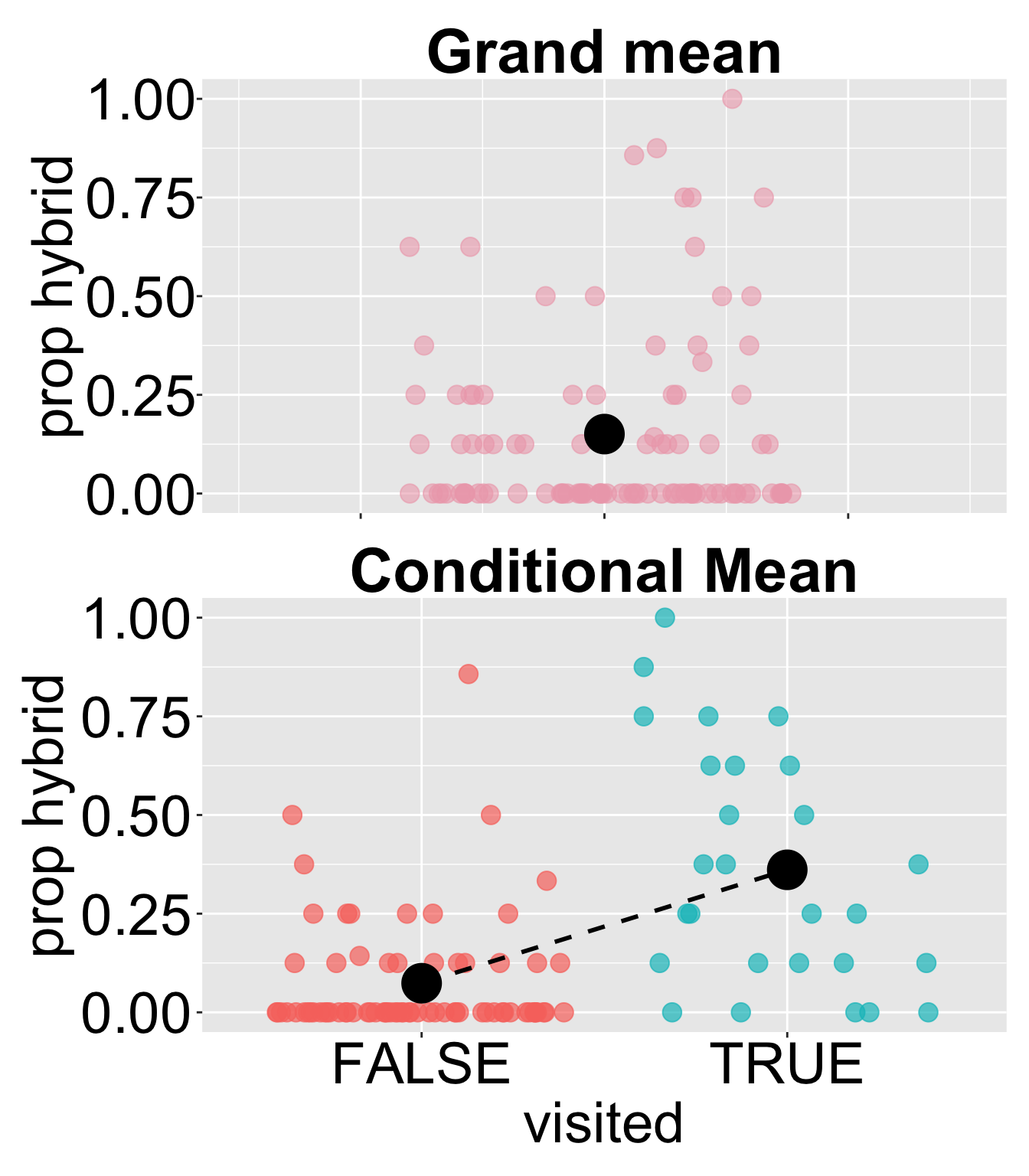
For example, for our RIL data planted at site GC, the “grand mean” proportion of hybrids formed across all RILs is around 0.15. .
The mean proportion of hybrids formed across all RILs is around 0.15.
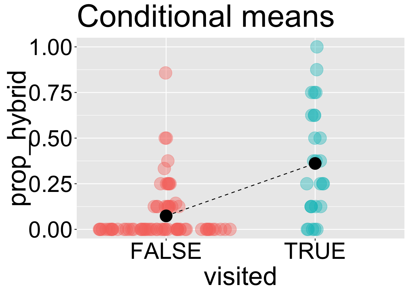
Similarly, the means of prop_hybrid conditional on visitation status are around 0.07 for flowers that “weren’t visited” and 0.36 for those that were visited.
A common summary of the association between a categorical explanatory variable and a numerical response is the difference in conditional means across groups. In this case, the difference in conditional means is approximately 0.29.
Above, we found that on average, visited plants produced 0.287 more hybrids than unvisited ones. That might seem like a big difference — but raw differences can be hard to interpret on their own. Is 0.287 a lot? A little? To better understand how meaningful that difference is, we can compare it to the variability in hybrid seed production. Cohen’s D helps us do just that — it standardizes the difference in means by the vraiabiliuty within groups (the pooled standard deviation), allowing for more intuitive comparisons across studies and systems. For this dataset, that gives us a D of 1.4 (see calculation below) — a very large effect size (see guide in margin). This suggests that being visited (during our observation window) is strongly associated with producing more hybrid seeds.
There aren’t hard and fast rules for interpreting Cohen’s D — this varies by field — but the rough guidelines are presented below. Our observed Cohen’s D of 1.4 is very large.
Size
Range of Cohen’s D
Not worth reporting
< 0.01
Tiny
0.01 – 0.20
Small
0.20 – 0.50
Medium
0.50 – 0.80
Large
0.80 – 1.20
Very large
1.20 – 2.00
Huge
> 2.00
Cohen’s D - the difference in group means divided by the “pooled standard deviation” allows us to better interpret such difference.
The pooled standard deviation is simply the standard deviation of observations from their group mean. We can find it in R as follows:
# finding the pooled standard deviationpooled_sd <- gc_rils |>group_by(visited)|>mutate(diff_from_mean = prop_hybrid -mean(prop_hybrid) )|>ungroup()|>summarise(sd_group =sd(diff_from_mean)) |>pull()# Print this outsprintf("The pooled sd is %s",round(pooled_sd, digits =3))
[1] "The pooled sd is 0.2"
cohensD <- (mean_visited - mean_notvisited) / pooled_sd # Print this outsprintf("Cohen's D is (%s - %s)/(%s) = %s",round(pooled_sd, digits =3),round(pull(mean_visited) , digits =3),round(pull(mean_notvisited), digits =3),round(pull(cohensD) , digits =3) )
[1] "Cohen's D is (0.2 - 0.361)/(0.074) = 1.439"
Visualizing a categorical x and numeric y
Visualizing the difference between means is surprisingly difficult.Visualizing the difference between means is surprisingly difficult. One particular concern is overplotting — because categorical variables have only a few possible values on the x-axis, data points can stack or overlap, which can obscure patterns in the data.
Below I work through a brief slide show revealing some challenges and some solutions.