• 8.Ordination summary
Links to: Summary. Questions. Glossary. R functions. R packages. More resources.
Chapter summary
Modern biological datasets often have more traits than we can look at or make sense of directly. Ordination approaches help us see structure in these large and complex datasets. These techniques reduce dimensionality: they summarize patterns across many variables into just a few new ones that soak up as much variation in the data as possible. When data are numeric and well-behaved, we typically use PCA. But when variables are categorical, mixed, or messy (as is common in ecological or genomic data), PCA can mislead. In these cases, alternatives like MCA, FAMD, PCoA, NMDS, t-SNE, and UMAP (among others) may be more appropriate. Some work with distances, others with probabilities. Some produce axes you can interpret; others are just for visualizing structure. Whatever method you use, make sure you understand its assumptions, limitations, and how to interpret its output - such approaches are no better than the scientist using them.
Chatbot tutor
Please interact with this custom chatbot (link here) I have made to help you with this chapter. I suggest interacting with at least ten back-and-forths to ramp up and then stopping when you feel like you got what you needed from it.
Practice Questions
Try these questions! By using the R environment you can work without leaving this “book”. To help you jump right into thinking and analysis, I have loaded the necessary data, cleaned it some, and have started some of the code!
Warm up
Q1) For which of these cases is a PCA most appropriate?If you chose option 1, you’re not totally off base — PCA does involve correlations between variables. But if all you want is to measure the strength or direction of association between two continuous variables, a correlation coefficient (like Pearson’s r) is simpler, more interpretable, and more appropriate.
If you chose option 2, congrats 🥳, This is the core purpose of PCA — reducing dimensionality by summarizing structure in multivariate continuous data.
If you chose option 3, you’re describing a tricky (but common) dataset. Unfortunately, PCA isn’t great at handling messy or mixed data. It requires complete, numeric data — missing values break it, and categorical variables need special handling.
If you chose option 4, that’s a common motivation and frequent misinterpretation. Sure, PCA might reveal clusters in the data, but that’s not what PCA is for. If clustering is your goal, use clustering methods (e.g. k-means, hierarchical clustering, which we will get to later – i hope) instead.
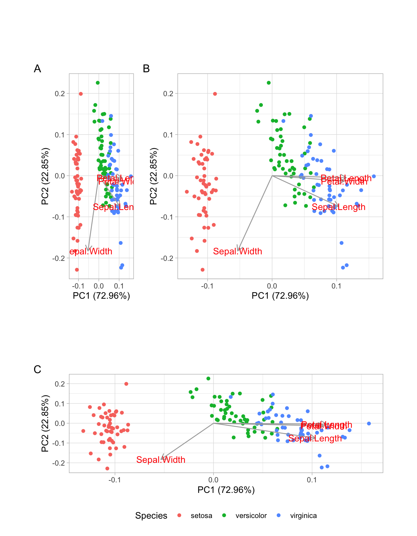
Example Plot 1
Consider the plot below - a PCA of the iris data set, as you answer questiosn two through six.
.
BONUS: What would you do?Q6 Write a brief paragraph summarizing this plot.
Example Plot 2
I made a PC from wild Clarkia (not RILs) collected at the Sawmill road hybrid zone. Note the data are centered and scaled. Use this webR workspace to answer question seven (below).
Look into trait loading, either by typing tidy(saw_pca, matrix = "loadings") or by adding loadings = TRUE, loadings.label = TRUE to autoplot().
You can see that PC2 is basically id – a variable it is not anything we ever should not consider as biologically interesting.
Example Plot 3
Use the data below to answer questions eight and nine.
Q9) Fix all the mistakes above (not just the biggest one) and remake this plot. What percent of variability in the data is attributable to PC2
Look into trait loading, either by typing piping PCA output to tidy( matrix = "loadings") or by adding loadings = TRUE, loadings.label = TRUE to autoplot().
Look into at the variable associated with PC1. Remove the most filter() for all data except the mostextreme value.
Make a pca, be sure to center and scale your axes!
PCAlternatives
Q10) In which of the following ordination methods is it most appropriate to interpret the distance between points in the plot as representing similarity between samples?
PCA (Principal Component Analysis) and PCoA (Principal Coordinate Analysis) use Euclidean geometry, so distances between points are interpretable (although PCoA distanses are in units of distance given by the distance matrix) — if you scale the axes to reflect the variance explained. If you don’t, you can distort distance and angle relationships.
NMDS doesn’t preserve absolute distances — only the rank order of pairwise distances (who’s closest to whom). The same goes for t-SNE and UMAP, which emphasize local neighborhood structure but distort global distances. So while clusters might look compelling, distances between them often lie.
You’ve got a huge dataset from museum specimens: 4 continuous variables (e.g., bill length, wing chord, body mass, tarsus length)
2 ordered categorical variables (e.g., molt stage from 1–5, plumage brightness from dull to vibrant)
Several missing values in most rows
You want to visualize broad patterns and see if anything jumps out. Which approach is the least bad?
None of these is perfect, but FAMD is probably your best bet if you carefully impute missing values (e.g., using missMDA::imputeFAMD()). PCA drops all incomplete rows; NMDS can’t handle mixed variable types or NA; UMAP will happily embed noise and call it structure.
📊 Glossary of Terms
📚 1. Concepts of Ordination
Ordination A general term for methods that reduce complex, high-dimensional data into fewer dimensions to help us find patterns or structure. Useful for summarizing variation, visualizing groups, or detecting gradients in data.
Dimensionality Reduction The process of collapsing many variables into a smaller number of “components” or “axes” that still explain most of the relevant variation.
Distance Matrix A table showing how different each pair of observations is, based on some measure (e.g., Euclidean, Bray-Curtis). The starting point for many non-linear ordination methods.
Scores The new coordinates of each sample on the reduced axes (like PC1, PC2, or NMDS1, NMDS2). These are what we usually plot.
Loadings The contribution of each original variable to a principal component. They tell us what the new axes “mean” in terms of the original traits.
Proportion of Variance Explained (PVE) How much of the total variation in the data is captured by each axis (e.g., PC1, PC2). Higher values suggest the axis captures an important pattern.
🔢 2. PCA and Matrix-Based Methods.
Principal Component Analysis (PCA) A technique that finds new axes (principal components) that capture as much variation as possible in your numeric data. Based on eigenanalysis of the covariance or correlation matrix.
Eigenvalues Numbers that describe how much variance is associated with each principal component.
Eigenvectors The directions (in trait space) along which the data vary the most — the basis of your new axes (PC1, PC2…).
Centering and Scaling Centering subtracts the mean of each variable; scaling divides by the standard deviation. This standardizes variables to make them comparable before running PCA.
Singular Value Decomposition A matrix factorization technique that expresses a matrix as the product of three matrices: U, D, and Vᵗ. PCA is often computed using SVD of the centered (and sometimes scaled) data matrix.
🎲 3. Categorical and Mixed Data
Multiple Correspondence Analysis (MCA) A PCA-like method for datasets made up of categorical variables (e.g., presence/absence, categories). Often used for survey or genetic marker data.
Factor Analysis of Mixed Data (FAMD) Combines ideas from PCA and MCA to handle datasets with both continuous and categorical variables.
Multiple Factor Analysis (MFA) Used when your data come in blocks (e.g., gene expression + morphology + climate). It balances across blocks to find shared structure.
🧭 4. Distance-Based Ordination.
Principal Coordinates Analysis (PCoA) finds axes that best preserve distances between samples, based on any distance matrix (e.g., Bray-Curtis, UniFrac, Jaccard). Results resemble PCA but from a different starting point.
Non-metric Multidimensional Scaling (NMDS) A distance-based method that tries to preserve the rank order of distances. Great for ecology or microbiome data. Axes have no fixed meaning — they just help you visualize structure.
🌐 5. Nonlinear Embedding Methods.
t-SNE (t-distributed Stochastic Neighbor Embedding) A nonlinear method that preserves local structure (similarity between nearby points) but often distorts global structure. Good for finding clusters but not for understanding axes.
**UMAP (Uniform Manifold Approximation and Projection)* A newer nonlinear method like t-SNE, but faster and often better at preserving both local and global structure. Often used for visualizing high-dimensional data like RNA-seq or image features.
🛠️ Key R Functions
🔢 Principal Component Analysis (PCA)
prcomp(): Performs PCA for you. Rememmber to always typecenter = TRUE, and to usually typescale = TRUE, (unless you think scaling is inappropriate.eigen(): Find eigenvectors and eigenvalues of a matrix. Pair this withcov()orcor()if you want to run a PCA withoutprcomp().
augment()In thebroompackage: Adds PCA scores to the original data for plotting or further analysis.tidy()In thebroompackage: Makes a tidy tibble for key outputs the prcomp output (The specific outpput depends on thematrix =option).tidy(, matrix = "pcs"): Makes a tibble showing the variance attributable to each PC.
tidy(, matrix = "loadings"): Makes a tibble describing the loading of each trait onto each PC.
tidy(, matrix = "scores"): Makes a tibble showing the value of each sample on each PC. This is simple a long format version of the output ofaugment().
autoplot(): In theggfortifypackage. Plots PCA results with groupings, or loadings arrows.theme(aspect.ratio = PVE_PC2/PVE_PC1): This is a specific use of ggplot2’stheme()function, which we will discuss more later. Be sure to add this to all of your PC (or PC-like) plots to help make sure readers do not misinterpret your results. Find PVE_PC1 and PVE_PC2 from your eigenvalues in youprcomp()output (or more easilytidy(, matrix = "pcs"):).
🔎 Categorical & Mixed Data Ordination
MCA(): In theFactoMineRpackage performs Multiple Correspondence Analysis for categorical variables.FAMD(): In theFactoMineRpackage performs a Factor Analysis of Mixed Data (categorical + continuous variables).fviz_...In thefactoextrapackage are helper functions to make plots from MCA and FAMD output.
🧭 Distance-based methods.
vegdist(): In theveganpackage makes a distance matrix for many common distance measures.cmdscale()Allows for classical multidimensional scaling on a distance matrix (as in PCoA).metaMDS()In theveganpackage performs NMDS on a distance matrix.
🌐 UMAP & Visualization
R Packages Introduced
broom: Tidies output from PCA (tidy(), augment()) into easy-to-use data frames.ggfortify: Simplifies plotting of PCA and other multivariate objects usingautoplot().FactoMineR: Provides functions for multivariate analyses like MCA, FAMD, and MFA.factoextra: Makes it easy to visualize outputs from FactoMineR analyses (fviz_mca_ind(), fviz_famd_var(), etc.).vegan: Used to compute distance matrices (vegdist()), run PCoA (cmdscale()) and NMDS (metaMDS()).uwot: Performs UMAP for dimensionality reduction of high-dimensional data.
Additional resources
Web resources:
- Introduction to ordination – By our coding club.
- Principal component analysis – Lever et al. (2017).
- Be careful with your principal components – Björklund (2019).
- A gentle introduction to principal component analysis using tea-pots, dinosaurs, and pizza – Saccenti (2024).
- Uniform manifold approximation and projection – Healy & McInnes (2024).
- Seeing data as t-SNE and UMAP do – Marx (2024).
- Understanding UMAP.
- How to Use t-SNE Effectively by Wattenberg et al. (2016).
Videos:
StatQuest: Principal Component Analysis (PCA), Step-by-Step from StatQuest.
How to create a biplot using vegan and ggplot2 (From Riffomonas project).
Using the vegan R package to generate ecological distances (From Riffomonas project).
Running non-metric multidimensional scaling (NMDS) in R with vegan and ggplot2 (From Riffomonas project).
Performing principal coordinate analysis (PCoA) in R and visualizing with ggplot2 (From Riffomonas project).