• 8. PCA – Gotchas
Motivating Scenario: You’ve used PCA and know how it works, but now it’s time to critically evaluate a PCA. What should you watch out for?
Learning Goals: By the end of this subchapter, you should be able to:
Make a checklist of things to consider when looking at a PCA and know how to evaluate them critically.
- Know not to overinterpret PC axes with little explanatory power.
- Know to look out for a horseshoe shape suggesting non-linearity.
- Know to watch out for how missing data are handled.
- Know when data should (not) be scaled.
- Know why variables should not be redundant.
- Know that PCA goes after the variance in the data, so the data matter a lot.
- Know not to overinterpret PC axes with little explanatory power.
Recognize that sampling efforts impact PCA results.
- Know to consider evenness of sampling when interpreting results.
- Know that results of a PCA DO NOT generalize.
- Know to consider evenness of sampling when interpreting results.
Now that we can run a PCA and know how they work, let’s think hard about how to interpret PCA results. These expand on warnings I made in the PCA quickstart and/or in the previous chapter, but now we can approach them with a bit of sophistication. I first start with a list of things to worry about. You should ask these questions of every PCA you see. Next I look more deeply into the idea that PCA goes after the variance in the data, so the data matter a lot.
Proceed Cautiously Ahead
I previously listed some first things to do when you see a PCA. These include:
- Understanding the structure of the data.
- Connecting this structure to a biological interpretation (but watch out for artifacts – see below).
- Thinking about what could have gone wrong in this PCA (I specifically noted to be wary of a horseshoe shape).
PCA evaluation checklist:
Could structure be an artifact?
In large scale datasets (such as -omics, or cases in which many people collected data or data are stratified), some portion of the variance might be caused by artifacts like who collected the data, which run of an instrument was used, what time the data was generated etc. rather than the motivating idea.
Your life will be better if you try to randomly spread such potential artifacts randomly across your more exciting biological factors, rather than identifying their potential impact later.
Before rushing to interpret results biologically always look into the boring explanations. You can check for these issues by making exploratory data visualizations or evaluating associations between such boring variables (observer, batch, time of day etc) and PCs of interest.
Was the interpretation of 2D shape justified?
Sometimes PCA plots show compelling shapes — curves, clusters, gradients — that are tempting to interpret biologically. But be cautious: these shapes don’t always reflect complex biology. For example, Luca Cavalli-Sforza famously used PCA to study human genetic variation. While foundational, some of his interpretations of the shapes in PC space were unjustified — Novembre & Stephens (2008) found that these patterns can arise from much simpler processes. Similarly, 2D structure can arise from nonlinearity in just one dimension.
When you see an interesting shape in a PCA plot, don’t jump straight to a complex biological story. Ask if it could be generated by a simple process.
Could the way in which missing data were handled impact PCs?
If you want to run a PCA with missing data you have some decisions to make. Ideally, no data are missing, but of course this is not always possible – for example in genomic analyses, data are often missing because not all sites are sequenced in all individuals.
- Assigning each missing data point to the mean for that trait is a common practice, but if some individuals are missing more data than others they will be brought towards the center of PC space. This can be misleading — it makes individuals with lots of missing data appear artificially close to the center of PC space, even if their true trait values are far from average. This is a known for the types of population genomic analyses I do (Yi & Latch (2022)).
- Alternatively imputing the missing data can give us more confidence in the shape of our PCs than we deserve and could mislead us by assigning wrong values to an individual’s traits.
One simple check is to plot the value of a PC on the y-axis against the proportion of missing data on the x-axis. Any linear or nonlinear trend is worrying.
Did you do something silly? This is somewhat embarrassing but I almost added id as a variable in this PCA. Of course id should not be numeric, and is meaningless. So if I made this mistake and got super lucky there is just some noise in PC1. But it could be way worse, if id non-randomly assigned, it gets a meaningful weighting in PC space and we get super confused. So be sure you don’t make any such silly mistakes.
Should data (not) be scaled?
We discussed this at length in the previous section — we usually scale variables so that differences in scale and variability don’t mislead us. But do we always want to give equal weight to variables with very different amounts of variance?
Take a PCA based on SNPs: scaling the data means that variation at a locus with a very rare allele is treated as just as important as variation at a highly polymorphic locus. That might not be a good idea. In some cases — like when differences in variance reflect meaningful biological differences, or when variables are on the same scale already — you may want to skip scaling. But be cautious – Lever et al. (2017) suggest that when variables are similar, we should not scale the data.
Are variables redundant?
PCA is most useful when variables are correlated, since it finds axes that summarize that structure. that capture the structure of correlations in the data. But data should not be redundant.
For example the full Clarkia dataset contains measurements of both petal area and petal circumference. Such variables are very similar, so putting them both into a PCA is essentially double-counting flower size. This redundancy means that a PCA will allocate more variance to the shared dimension, exaggerating its importance. Consider reducing highly correlated traits to one value (e.g. their mean) or removing the less interpretable variable. How correlated is too correlated? There is no hard and fast answer, but I suggest considering collapsing or removing variables when the absolute value of their correlation, \(|r|\), exceeds 0.9.
What data went into the PCA and how even was sampling? PCA finds combinations of traits that best capture the variance in the data. Thus, is quite sensitive to the sampling scheme. I expand on this below!
PCA depends on what you put into it
When John Novembre showed that a PCA of genetic variation of Europeans looked a lot like a map of Europe, he knew what he was doing. He made a few specific decisions in his sampling and analysis, including – making sure that all sampled individuals had all four great grandparents from the same location, and that sampling was even across Europe. Had John sampled mostly Spaniards with a few other individuals spread around from across Europe, PCs would not make a map of Europe - but rather a somewhat distorted map of Spain. This is all to say that the details of sampling impact results of a principal component analysis.
Just as sampling matters, so does the choice of what variables go into the PCA. John used many genetic markers from across the genome. A PCA based on the ABO locus would find clusters of blood groups, while a PCA based on morphology would look different in some other way.
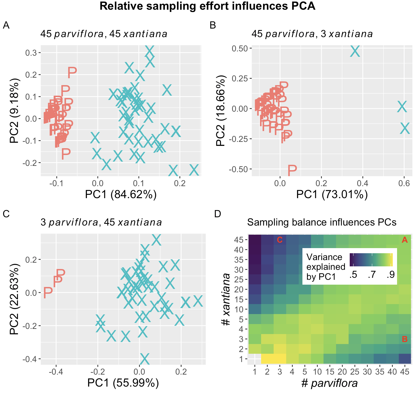
Figure 1 uses data from a natural hybrid zone between Clarkia xantiana subspecies to illustrate the importance of sampling effort. Panels A-C show a PC-plot based off of three floral traits – petal area, anther stigma distance, and the time between pollen release and ovule receptivity – when different numbers of parviflora and xantiana are sampled. The top left panel (Figure 1 A) shows that with 45 samples of each subspecies from site SAW, PC1 captures 84.6% of the variance in the data. The three “xantiana” samples with PC1 values near zero may be first generation hybrids. Figure 1 shows that the variance attributable to PC1 decreases when sampling 45 parviflora and 3 xantiana, and Figure 1 C shows that this decreases further when sampling 3 parviflora and 45 xantiana. Figure 1 D shows the average proportion variance explained by PC1 across different sampling efforts. This illustrates the broader point: PCA doesn’t tell us about populations, but about variation in the data we choose and how we sample.