You have multidimensional data and are thinking about doing a PCA - but you know your data aren’t quite right for it. Or maybe you’re reading a paper or looking at a plot that clearly isn’t a PCA, but it looks a lot like one. You want to get a sense of what PCA-like methods are out there, when to use them, how they work, and how to make sense of their output.
Learning Goals: By the end of this subchapter, you should be able to:
Know when to pause before running PCA just because it’s familiar.
Describe the goals and assumptions of common PCA-like methods
Know which methods work with distance matrices (e.g., PCoA, NMDS).
Understand which methods work with categorical or mixed data (e.g., MCA, FAMD).
Choose an appropriate method for your data and goals
Given a dataset, identify which PCA-like method is most appropriate and why.
Recognize common use cases for PCoA, NMDS, MCA, FAMD, t-SNE, and UMAP.
Interpret the output of PCA-like analyses recognizing what they mean (e.g. when distances are or are not meaningfull etc..)
The PCA framework is enormously popular because it provides a straightforward approach for working with multidimensional data. This is becoming even more relevant as the “big data” or “omic” era makes the collection of massive datasets commonplace. However, despite the incredible popularity of principal component analysis, it is not always the right tool for the job. PCA works by combining all traits into new “summary traits” - linear combinations of the originals, each with its own set of weightings. This means it assumes that the main patterns in the data can be captured by adding up traits in the right proportions. But this assumption doesn’t always hold. When data are nonlinear, categorical, or behave strangely (as is often the case in ecological datasets), PCA can give misleading results.
In this section, we introduce alternatives to PCA. Each alternative aims to solve a specific limitation of PCA. But before diving too deep into this section I want to warn you that this is both non-exhaustive (there are even more PCA-like approaches), and fairly superficial (I only briefly discuss these techniques). My goal here is to give you enough information to know what these methods do, when and why they are used, how they differ from PCA (and each other), and references / links so you can learn more.
When data aren’t (all) continuous
PCA assumes that data are continuous and have nice distributions. Although PCA can still be run when these assumptiosn are not met (John Novembre’s map of Europe was generated from 0/1/2 data – noting the number of ‘alternative’ alleles at a locus), there are PCA -like approaches made for categorical data and for a mix of data types.
Multiple Correspondence Analysis (MCA)
MCA is appropriate when all your variables are categorical, especially nominal variables with multiple categories. MCA applies a method similar to PCA to uncover patterns of association among the categorical variables and reduce dimensionality.
You can run an MCA using the mca() function from the MASS package in R, or for more in-depth analyses and nicer figures you may want to use the MCA function in the factoMineR package. You interpret the output much like a PCA. That is, each axis summarizes shared patterns across the variables, and the biplot shows which samples and categories tend to cluster together. Nice and clear start! Here are a few suggested edits to tighten grammar, clarify the meaning, and better match the tone and structure from earlier in your book:
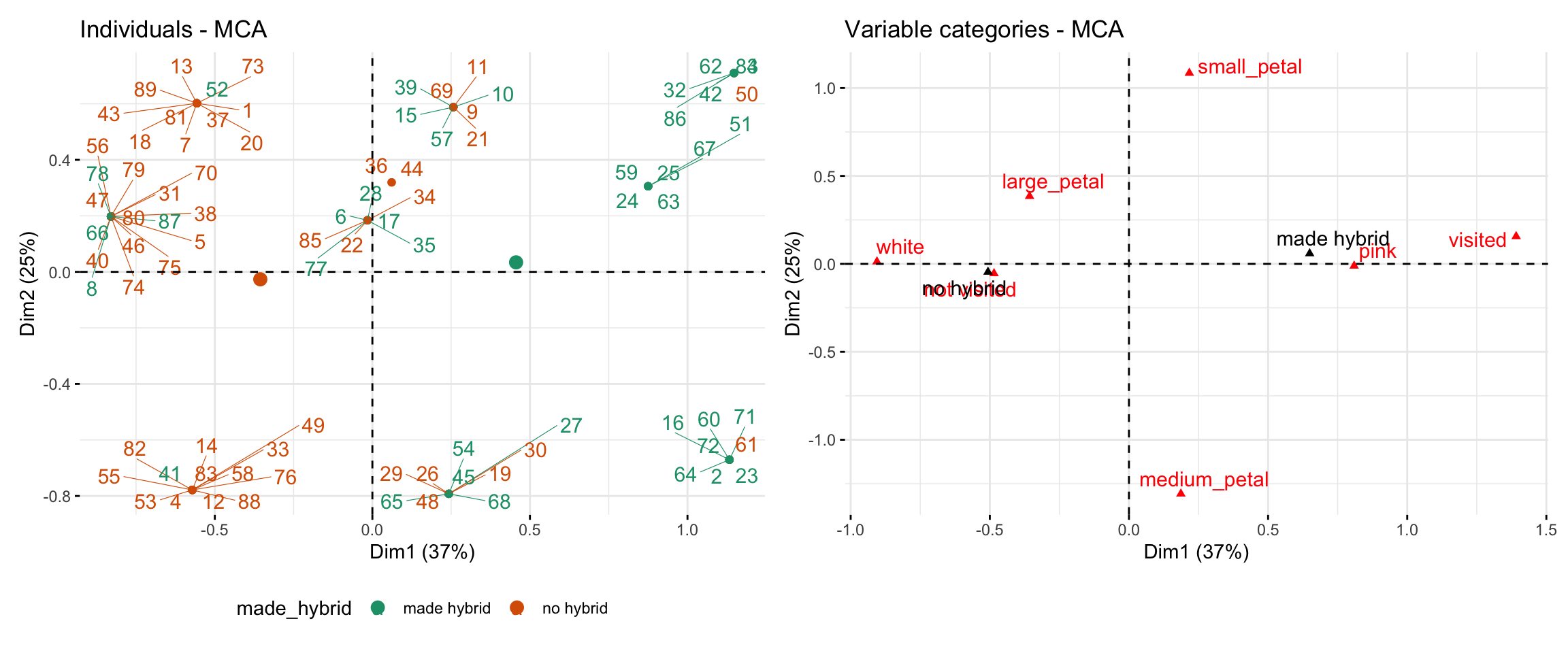
The code below and the resulting figure (Figure 1) show a worked example using the parviflora RIL dataset. The MCA analysis includes three categorical traits: visited (whether the plant received any visits), petal_color, and petal_area (binned as small / medium / large). Points are colored by whether each plant made at least one hybrid. Dim 1 (which is like PC1) separates plants with pink petals and visits from those with white petals and no visits — and aligns closely with whether or not the plant made a hybrid.
Code for selecting data for MCA from RILs planted at GC
library(FactoMineR)library(factoextra)library(forcats)library(patchwork)mca_result <- gc_rils_4_mca |>mutate_all(as.factor)|># The MCA function needs variables to be factorsMCA(quali.sup ="made_hybrid",graph =FALSE) # quali.sup means ignore this column (made hybrid)# we want this to look at our MCA, but not to go into MCA# Visualize individuals (samples)mca_plot <-fviz_mca_ind( mca_result, habillage ="made_hybrid", repel =TRUE,col.var ="darkgrey" ,palette ="Dark2")+theme(legend.position ="bottom", aspect.ratio =25/37)mca_loadings<-fviz_mca_var(mca_result, repel =TRUE,col.quali.sup ="black")mca_plot + mca_loadings
Figure 1: Multiple Correspondence Analysis (MCA) of categorical traits in parviflora RILS.Left panel: Individuals are plotted in MCA space based on Dim 1 (37% variance explained) and Dim 2 (25%). Each point represents a RIL, colored by whether it made hybrid seed (made_hybrid) or not. Lines connect individual labels to the data point they are assocaited with. Right panel: Positions of each variable category in the same MCA space. Categories closer together (e.g., pink and visited) tend to co-occur. Dim 1 separates lines with small petals, no visits, and no hybrids (left) from those with larger petals and more visits (right).
Factor Analysis of Mixed Data (FAMD)
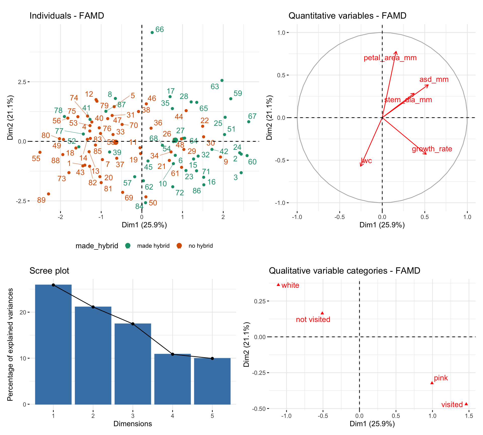
So, PCA works for continuous variables and MCA works for categorical variables, but what if your dataset has both? Don’t despair, Factorial Analysis of Mixed Data (FAMD) allows us to analyze datasets that include both quantitative and categorical variables. FAMD is a blend of PCA and MDA giving appropriate weights to each. Running this on our parviflora RILs at GC with categorical variables visited and petal_color, and continuous variables petal_area_mm, asd_mm, growth_rate, stem_dia_mm, and lwc, we see that large values in Dim 1 are associated with making hybrid seed ( Figure 2 ).
FAMD scales and balances the contributions of each variable type so that no one type dominates. You interpret the output like PCA: samples that cluster together in the reduced space tend to share trait combinations — whether continuous, categorical, or both. You can run FAMD with the FAMD() function in the FactoMineR package and make plots with functions in factoextra package.
Code for selecting data for FAMD from RILs planted at GC
Distance-based methods for nonlinear numeric data: PCoA and NMDS
In many cases, data have complex distributions that might do weird things to PCA. For example, Brooke has collected data not just on the number of pollinator visits, but on how many of each species visited each plant. Similarly, studies of the microbiome or environmental microbiology, often describing the relative frequency of different microbes in various environments.
Euclidean distance: The straight-line distance between two points. Great when your variables are continuous and on the same scale (e.g., plant height and leaf area). Results of a PCoA based on euclidean distance are often nearly identical to a PCA.
Hamming distance: Counts how many features differ. Often used for binary strings (e.g., how many loci differ in genotype).
Bray–Curtis dissimilarity: Compares counts, like how many visits each plant got from each pollinator or how many read counts of each so-called “observed taxonomic unit” (OTU). Bray–Curtis dissimilarity is sensitive to both presence and abundance.
Jaccard distance: Looks at shared vs. unique elements. Good for presence–absence data (e.g., which microbes are present in each soil sample).
One approach to deal with such cases is to develop a “distance matrix” – an \(N \times N\) table that shows how different each pair of samples is from one another. There is no universal way to define a distance – the right distance depends on your data (see options on our right). We then summarize this \(N \times N\) distance matrix into a lower-dimensional summary of the data.Two common approaches – PCoA and NMDS do this in slightly different ways.
Principal Coordinate Analysis (PCoA)
Principal Coordinate Analysis (PCoA) runs an analysis similar to PCA on any distance matrix you give it. Specifically it takes the distance matrix and “double-centers” the data (A math trick that allows us to treat a distance matrix like traits for a PCA) and then runs an eigenanalysis.
Running a PCoA: The most common way to run a PCoA in R is to use the vegdist() function in the vegan package to make a distance matrix, and then provide this distance matrix to the cmdscale() function. Follow this link from Bakker (2024) for a bit more information.
Interpreting PCoA results: The output of a PCoA is nearly identical to PCA, but the axes are principal coordinates, and we do not consider trait “loading” because we do not consider traits.
Non-metric Multidimensional Scaling (NMDS)
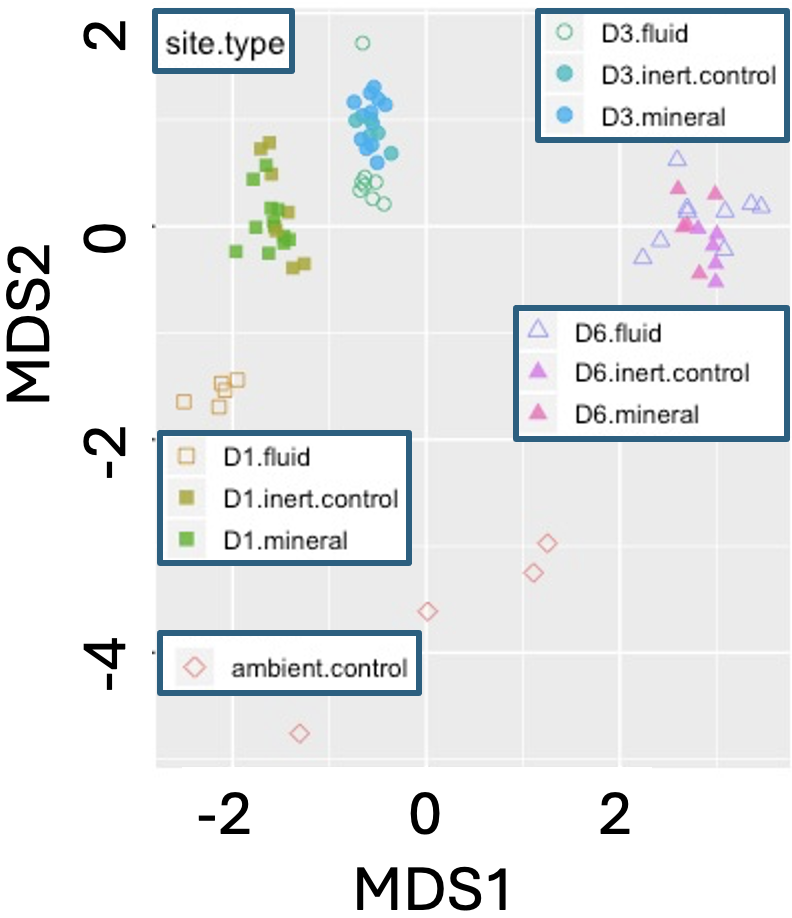
Figure 3: NMDS plot of microbial community composition from environmental biofilm samples. Points represent biofilm samples collected across three sites (D1, D3, D6) and treatment types (fluid, inert control, mineral), plus an ambient control. The plot is based on Bray–Curtis dissimilarity of OTU (operational taxonomic unit) counts from environmental sequencing. Groupings indicate that microbial community composition differs across both location and treatment. Adapted from a blogpost by Caitlan Casar.
When data are so messy that any actual distance is difficult to interpret, we turn to NMDS. Like PCoA NMDS starts with a distance matrix, but then instead of using eigenanlysis, NMDS uses a complex algorithm to preserve the rank similarity of pairs of samples in a pre-specified (usually two or three) number of dimensions. The NMDS approach is useful because it can handle messy data, but using this approach means we lose the concept of “variance explained”, and interpreting results as distances between samples.
Running a NMDS: Like PCoA, we begin an NMDS analysis by using the vegdist() function to make a distance matrix. We then use vegan’s and then provide this distance matrix to the metaMDS() function. Follow this link from Bakker (2024) for a bit more information.
Interpreting NMDS results: Rather than reporting the percent variance explained, NMDS calculates stress – a summary of how well the NMDS analysis summarizes the data. Stress values less than 0.1 mean that NMDS is a reasonable summary, while values greater than 0.2 mean that NMDS does not do a good job of summarizing our data. We can also visualize data points in the MDS1 and MDS2 space (as in Figure 3) to understand the similarity between samples.
Capturing fine structure in high-dimensional space with t-SNE and UMAP
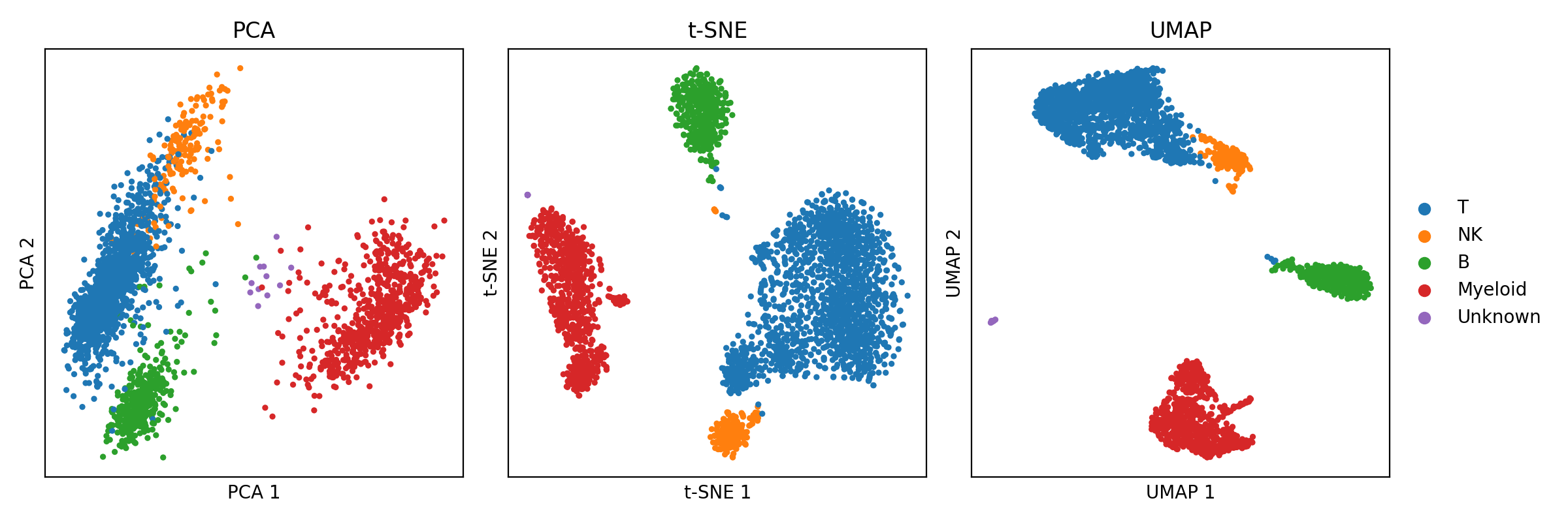
As datasets get larger, more heterogeneous, and more complex, there’s a growing need for fast ways to reveal structure in high-dimensional data. For example, single-cell RNA sequencing actually measures gene expression in thousands of individual cells—one cell at a time—while keeping data from each cell separate. Making sense of this high-dimensional data is challenging, and so we need techniques that allow for effective visualization. Two popular tools—t-SNE and UMAP—have become widely used for this purpose, and are now applied in many fields beyond single-cell analysis. These approaches can identify clusters in the data which might correspond to different cell types or states.
t-SNE is a technique for visualizing high-dimensional data by preserving local similarities - it tries to make sure that points that are close in the original space stay close in the plot. This means t-SNE is great at finding clusters, but the distances between clusters are mieaningless. That is, while points within a cluster are typically similar, two clusters being far apart (or close together) doesn’t necessarily mean anything. This nice explanation of how to carefully conduct and evaluate a t-SNE analysis is worth checking out if you want to learn more. But t-SNE is rarely used now that we have UMAP.
UMAP has largely taken over from t-SNE in many areas because it’s much faster and usually does a better job of preserving both local and some global structure. Like t-SNE, UMAP helps us find and visualize clusters. But unlike t-SNE, clusters that are closer together in UMAP space are often more similar, though the distances between them still don’t have a strict, interpretable meaning (as they would in PCA or PCoA). Read this fantastic UMAP tutorial, if you plan on running a UMAP, and look into this (slightly) more technical explanation by the people who invented this approach (Healy & McInnes (2024)).
Running UMAP in R: The most commonly used R package for UMAP is uwot, which is also used behind the scenes by the popular single-cell analysis package Seurat.
The umap2() function in uwot is preferred—it includes better defaults than the older umap() function.
Parameter choices matter, so it’s worth experimenting with options like n_neighbors (which affects how much local structure is preserved) and min_dist (which controls how tightly points are packed together in the plot).
An example of single-cell RNA-seq data from peripheral blood mononuclear cells visualized by PCA, t-SNE, and UMAP are shown below, taken from a blogpost by Matthew N. Bernstein.
The beautiful plots made by UMAP do not always truly highlight important biology. Read this warning in Chari (2023) before over-interpreting your results.
More broadly, with complex and non-transparent methods like t-SNE and UMAP it’s always worth looking for additional lines of evidence to ensure that we are not being misled.
Here’s a short, clean “Common Misinterpretations” box you can drop into your PCA Alternatives section. It’s in your tight, student-facing, biologically grounded style, and meant to fit naturally after method descriptions or before any review questions.
Just because you’ve reduced your multidimensional data into two dimensions doesn’t mean everything in the plot has a clear biological meaning. A few common pitfalls:
Overinterpreting t-SNE and UMAP plots These methods are built for visualization, not interpretation. The axes have no meaning. The global structure (e.g., distances between faraway clusters) often doesn’t reflect biological distance at all — only the local neighborhood structure is trustworthy.
Reading direction into NMDS axes NMDS axes can flip, rotate, or stretch between runs. The relative arrangement of samples matters, not the absolute axis values or orientations. Always look at patterns, not coordinates.
Assuming PCA alternatives give you “components” like PCA Only some methods (e.g., FAMD, MCA) return interpretable “axes” with loadings like PCA. For others, like NMDS and t-SNE, you don’t get a clear mapping from traits to axes.
Interpreting distance as Euclidean when it’s not If your method used Jaccard or Bray–Curtis distances, don’t interpret sample spacing as if it came from straight-line distances in trait space.
In short: don’t read more into the plots than the method can give you. Use them to explore, not to conclude.
Bakker, J. D. (2024). Applied multivariate statistics in R. Pressbooks.