• 3. Continuous y/categorical x
Motivating scenario: You want compare a continuous variable across different levels of a categorical explanatory variable.
Learning goals: By the end of this sub-chapter you should be able to
- Understand the challenge of overplotting.
- Use
geom_point,geom_jitter()and/orgeom_boxplot()to visualize the distribution.- Use the
sizeandalphaarguments to adjust the size and transparency of points.
- Use the
- Combine
geom_jitter()and/orgeom_boxplot(), noting that- Order matters - always plot jittered points on top of (i.e. after) boxplots.
- When showing boxplots and jittered points, make sure the boxplot does not show outliers, otherwise those points will be shown twice.
- Order matters - always plot jittered points on top of (i.e. after) boxplots.
Visualizing associations between a continuous response and categorical explanatory variable.
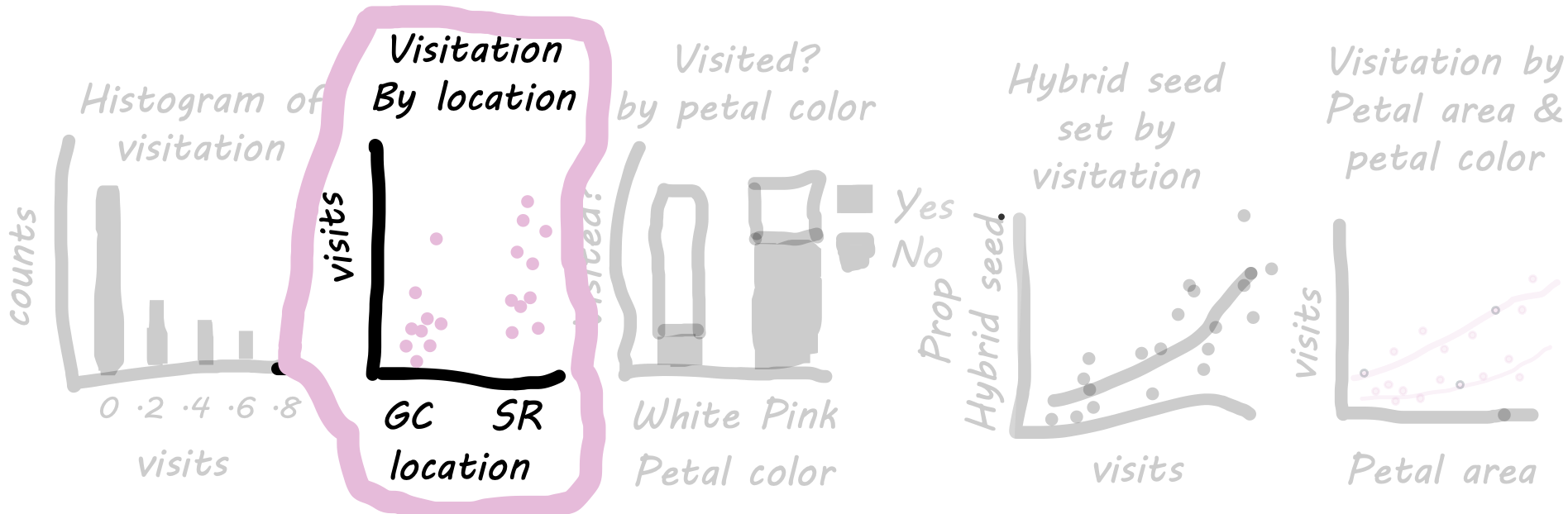
We often want to know more than just the distribution of variables, we want to know which, if any, explanatory variables are associated with this variation. So, for example, we may want to know if pollinator visitation differs by location. In this case we map the categorical variable (location) onto the x-axis and the continuous response (visitation) onto the y-axis.
To compare visitation by site, we start with this setup:
- Filter our data for samples from "GC" and "SR" (because we did not conduct pollinator observations at the other sites).
- Pipe this directly into our
ggplot()function.
Note: we do not need to specify the data argument when piping data. That is because ggplot inherits data from the pipe.
ril_data |>
filter(location == "GC" | location == "SR") |> # Pipe data into ggplot
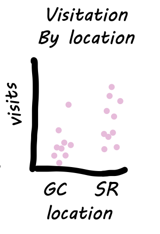
ggplot(aes(x = location, y = mean_visits))Continuous response to categorical explanatory variable: A Step-by-Step Guide: In the tabs below I show some options for our geom.
The Simplest Plot
- Uses the
geom_point()function to display the data.
- We can add a mean using
stat_summary().
Note: I plot the mean in red to make it stand out.
ril_data |>
  filter(location == "GC" | location == "SR") |>  # Pipe data into ggplot
  ggplot(aes(x = location, y = mean_visits)) +
  geom_point(size =2, alpha = 0.5) +
  stat_summary(size = 1.2, color = "red")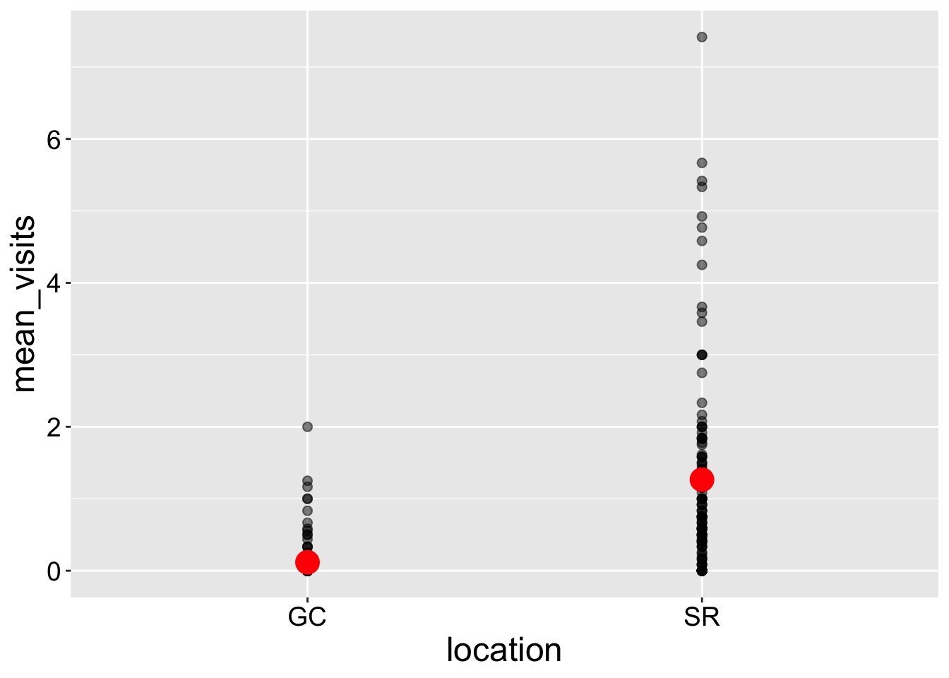
However, these figures can be difficult to interpret when many points overlap, making it hard to distinguish individual data points—this issue is known as over-plotting.
One way to address over-plotting is to adjust the transparency of points using the alpha argument. There are several other techniques to handle this, which we’ll explore in the next section.
Jitter plots spread out data along the x-axis. This works well with categorical predictors but can be misleading when used with continuous predictors. To improve clarity, I make a few adjustments in the geom_jitter() function:
- I set
height = 0to keep the y-values unchanged. I always do this.
- I set
width = 0.3to prevent points from overlapping too much between categories. You may experiment with this value to find the best fit for your plot.
- I make the points larger (
size = 3) and partially transparent (alpha = 0.5) to help visualize overlap more effectively.
ril_data |>
  filter(location == "GC" | location == "SR") |> # Pipe data into ggplot
  ggplot(aes(x = location, y = mean_visits))+
  geom_jitter(height = 0, width = .3, size = 3, alpha = .5)+
  stat_summary(size = 1.2,color = "red")
We can add multiple geom layers to a plot. For example, we can combine a boxplot (geom_boxplot()) with a jitter plot. However, there are a few important things to keep in mind:
- Order matters.
geom_boxplot() + geom_jitter()places points over the boxplot, making the data visible, whilegeom_jitter() + geom_boxplot()places the boxplot on top, potentially obscuring the points.
- Handling outliers.
geom_boxplot()automatically displays outliers as individual points, which is useful when we’re not showing the raw data. However, if we add jittered points withgeom_jitter(), these outliers will appear twice, potentially misleading us. To avoid this, I setoutlier.shape = NAin the boxplot.
ril_data |>
  filter(location == "GC" | location == "SR") |> # Pipe data into ggplot
  ggplot(aes(x = location, y = mean_visits))+
  geom_boxplot(outlier.shape = NA) +
  geom_jitter(height = 0, width = .3, size = 3, alpha = .5)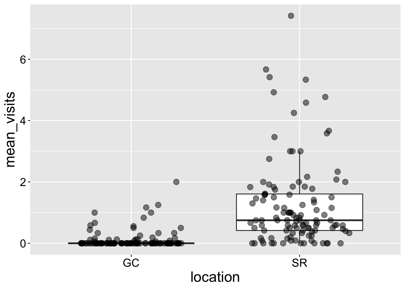
Interpretation: Returning to our motivating question, we see that plants at the SR population receive way more visits by pollinators than do plants at GC.