Motivating Scenario
You understand the idea of a correlation and covariance, as well as what linear models are doing. You now want to build and understand a linear model predicting a numeric response from a numeric explanatory variable.
Learning Goals: By the end of this subchapter, you should be able to:
Describe linear regression as a modeling tool
Recognize that a regression line models the conditional mean of the response variable as a function of a predictor.
Explain the meaning of slope and intercept
Interpret slope as expected change in the response per unit change in the predictor.
Interpret the intercept and understand when it is or isn’t meaningful.
Use a the equation from a linear regression to find the conditional mean for a given x value.
Calculate slope and intercept from formulas
Use covariance and variance to compute the slope.
Derive the intercept from sample means and the slope.
Understand residuals
Define and calculate residuals as observed minus predicted values.
Visualize residuals and understand their role in assessing model fit.
Use R to fit and explore a linear model
Build models with lm().
Inspect residuals and predictions with augment() from the broom package.
Know that predictions are only valid within the range of the data
A review of covariance and correlation
We have previously quantified the association between two numeric variables as:
A covariance: How much observations of \(x\) and \(y\) jointly deviate from their means in an individual, quantified as: \(\text{cov}_{x,y}= \frac{n}{n-1}(\overline{xy}-\bar{x} \times\bar{y}) = \frac{\sum (x_i-\bar{x})\times(y_i-\bar{y})}{n-1}\).
A correlation, \(r\): How reliably \(x\) and \(y\) covary – a standardized measure of the covariance. The correlation is quantified as \(r_{xy}= \frac{\text{cov}_{x,y}}{s_x\times s_y}\), where \(s_x\) and \(s_y\) are the standard deviations of \(x\) and \(y\), respectively.
While these measures, and particularly \(r\), are essential summaries of association, neither allows us to model a numeric response variable as a function of numeric explanatory variable.
Linear regression set up
So, how do we find \(\hat{y}_i\)? The answer comes from our standard equation for a line– \(y = mx +b\). But statisticians have their own notation:
\[\hat{y}_i = b_0 + b_1 \times x_i\] The variables in this model are interpreted as follows:
\(\hat{y}_i\) is the conditional mean of the response variable for an individual with a value of \(x_i\). Note this is a guess at what the mean would be if we had many such observations - but we usually have one or fewer observations of y at a specific value of x.
\(b_0\) is the intercept – the value of the response variable if we follow it to \(x = 0\).
\(b_1\) is the slope – the expected change in \(y\), for every unit increase in \(x\).
\(x_i\) is the value of the explanatory variable, \(x\) in individual \(i\).
Math for linear regression
Before delving into the R of it all, let’s start with some math. To make things concrete, we’ll consider the proportion of hybrid seed as a function of petal area.
Math for slope
We find the slope, \(b_1\), as the covariance divided by the variance in \(x\):
We find the intercept, \(b_0\) (sometimes called \(a\)), as
\[b_0 = \bar{y}-b_1\bar{x}\]
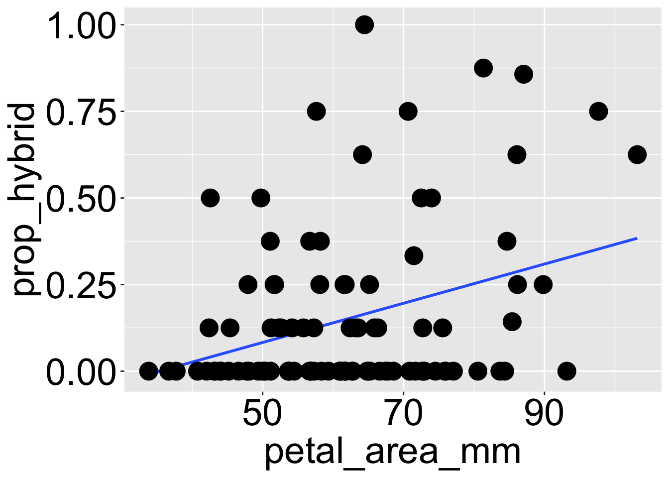
ggplot(gc_rils, aes(x = petal_area_mm, y = prop_hybrid))+geom_smooth(method ="lm", se =FALSE)+geom_point(size =6)
Interpretation
Figure 1: A scatterplot showing the relationship between petal area (in mm²) and the proportion of hybrid seeds in parviflora RILs, with a fitted linear regression line.
The calculations above (displayed in Figure 1) correspond to the following linear model:
The intercept of -0.208 means that if we followed the line down to a petal area of zero, the math would predict that such a plant would produce -20% hybrid seed. This is a mathematically useful construct but is biologically and statistically unjustified (see below). Of course, we can still use this equation (and implausible intercept), to make predictions in the range of our data.
The slope of 0.00574 means that every additional mm^2 increase in area, we expect about a half percent more hybrid seeds.
Do not predict beyond the range of the data.
Predictions from a linear model are only valid within the range of our observed data. For example, while our model estimates an intercept of –0.208, we certainly don’t expect a microscopic flower to receive fewer than zero pollinator visits. Similarly, we shouldn’t expect a plant with a petal area of \(300 \text{ mm}^2\) to produce more than 150% hybrid seeds.
These exaggerated examples highlight an important point: we should not make predictions far outside the range of our data. Even a less extreme prediction — say, estimating that a plant with 200 mm² of petal area will produce 95% hybrid seeds. Although this number may seem biologically plausible, we have no reason to trust that our model’s predictions hold beyond the range of data we collected.
Residuals
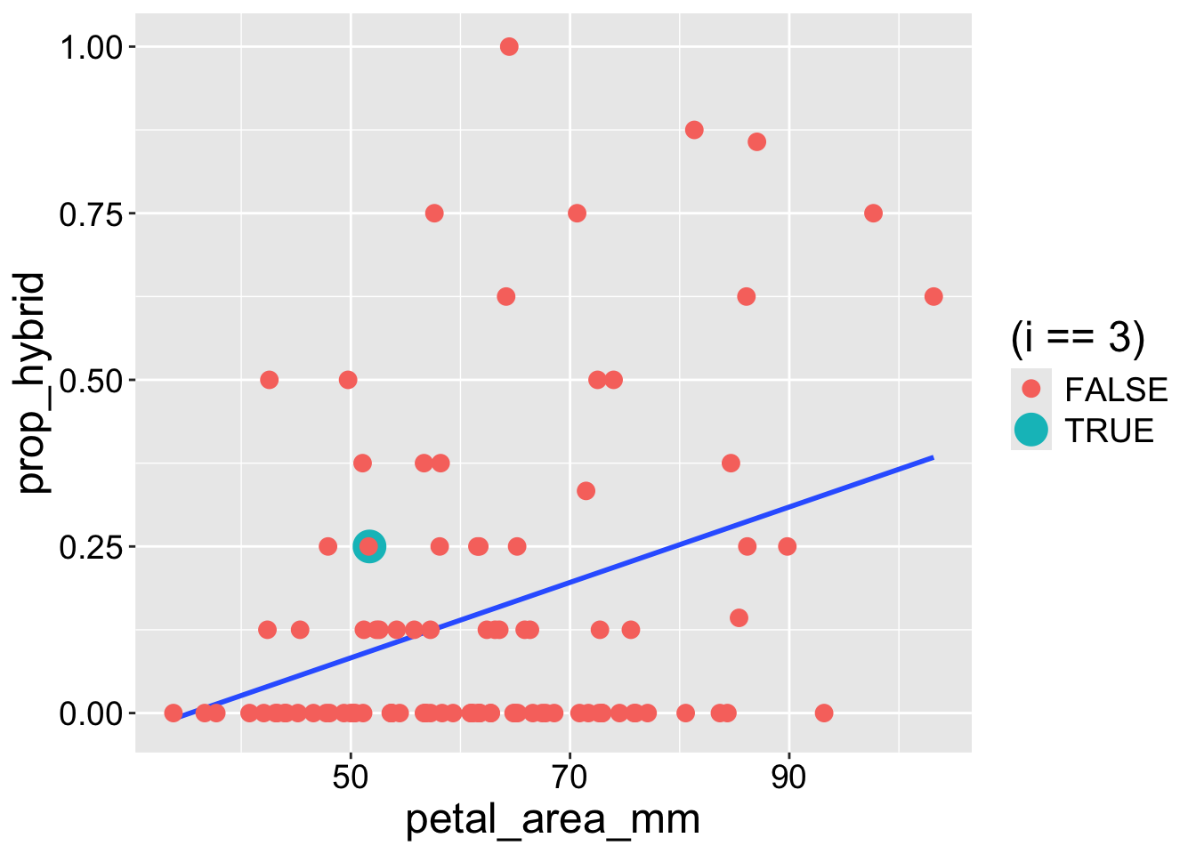
As seen previously, predictions of a linear model do not perfectly match the data. Again, the difference between observed, \(y_i\), and expected, \(\hat{y}_i\), values is the residual \(e_i\). Try to estimate the residual of data point three (green point) in Figure 2.
Code
ggplot(gc_rils|>mutate(i =1:n()), aes(x = petal_area_mm, y = prop_hybrid))+geom_smooth(method ="lm", se =FALSE)+geom_point(aes(color = (i==3), size = (i ==3)))+scale_size_manual(values =c(3,6))
Figure 2: The same scatterplot showing the relationship between petal area as in Figure 1. The highlighted point in turquoise marks plant 3, used as an example in the residual calculation. This point’s vertical distance from the regression line represents its residual
CONCEPT CHECK Looking at Figure 2, visually estimate \(e_3\) (the residual of point three in green)
Solution: The green point (\(i = 3\)) is at y = 0.25, and x is just a bit more than 50. At that x value, the regression line (showing \(\hat{y}\)) is somewhat below 0.125 (I visually estimate _{ mm}= 0.090$). So 0.250 - 0.090 = 0.160.
Math Approach: As above, let’s visually approximate the petal area of observation 3 as 51 mm. Plugging this visual estimate into our equation (with coefficients from our linear model):
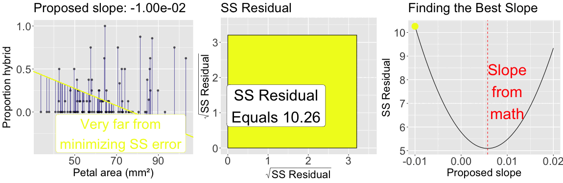
The slope minimizes \(\text{SS}_\text{residuals}\)
As seen for the mean, by looping over many proposed slope(\(-0.01\) to \(0.02\)) the plot below illustrates that the slope from the formula above minimizes the sum of squared residuals: The sum of squared residuals for a given proposed slope (with intercept plugged in from math) is shown: In color on all three plots (yellow is a large sum of squared residuals, red is intermediate, and purple is low); Geometrically as the size of the square, in the center plot; On the y-axis of the right plot.
Figure 3: The slope minimizes the sum of squared residuals: The left panel shows observed data points along with a proposed regression line. Vertical lines connect each point to its predicted value, illustrating residuals. The color of the line corresponds to the total residual sum of squares. The center panel visualizes the total squared error as a square whose area reflects the sum of squared residuals. The right panel plots the sum of squared residuals as a function of the proposed slope, with a moving point highlighting the current slope value. The slope that minimizes the sum of squared residuals defines the best-fitting line.
Using the lm() function
As before, we build a linear model in R as lm(response ~ explanatory). So to predict the proportion of hybrid seed as a function of petal area (in mm) type:
Again, we can view residuals and other useful things with the augment() function. Let’s go back to the webr section above and pipe the output of lm() to augment()
CONCEPT CHECK: Use the augment function to find the exact residual of data point 3 to three decimal places
Paste the code below into the webR window above to find the answer.
library(broom)lm(prop_hybrid ~ petal_area_mm, data = gc_rils) |>augment() |>slice(3) # You can just go down to the third, but I wanted to show you this trick
Looking forward.
You’ve now seen how we can model a linear relationship between two numeric variables, how to calculate the slope and intercept, and how the best-fitting line is the one that minimizes the sum of squared residuals. You’ve also interpreted these model components in a biological context, visualized residuals, and learned how to fit and explore a linear model in R.
In the next section, we extend linear models to include two explanatory variables.
Later in this book, we’ll introduce concepts of uncertainty and hypothesis testing and model evaluation to deepen our understanding of what these models can (and cannot) tell us, and when to be approrpiately skeptical about their predictions.
OPTIONAL EXTRA LEARNING.
\(r^2\) and the proportion variance explained
So far, we’ve focused on just one type of sum of squares — the residual sum of squares, \(\text{SS}_\text{residual}\) (also called \(\text{SS}_\text{error}\)). As you well know by now:
\(\text{SS}_\text{residual}\) describes the distance between predictions and observations, and is quantified as the sum of squared differences between observed values, \(y_i\), and the conditional means, \(\hat{y}_i\). \(\text{SS}_\text{residual} = \sum{(e_i)^2} = \sum{(y_i-\hat{y}_i)^2}\).
We will explore two other types of sums of squares later, but in case you can’t wait:
\(\text{SS}_\text{model}\) describes the distance between predictions and the grand mean, and is quantified as is the sum of squared differences between conditional means, \(\hat{y}_i\), and the grand mean, \(\bar{y}\). \(\text{SS}_\text{model} = \sum{(\hat{y}_i-\bar{y})^2}\).
\(\text{SS}_\text{total}\) describes the overall variability in the response variable, and is quantified as the sum of squared differences between observed values \(y_i\), and the grand mean, \(\bar{y}\). \(\text{SS}_\text{total} = \sum{(y_i-\bar{y})^2}\).
Dividing \(\text{SS}_\text{model}\) by \(\text{SS}_\text{total}\) describes “the proportion of variance explained” by our model, \(r^2\):