Motivating Scenario:
You are continuing your exploration of a fresh new dataset. You have figured out the shape and made the transformations you thought appropriate. You now want to get some numerical summaries of the center of the data.
Learning Goals: By the end of this subchapter, you should be able to:
Differentiate between parametric and nonparametric summaries: and know what shapes of data make one more appropriate than the other.
Calculate and interpret standard summaries of center in R. These include:
Median: The middle.
Mean: The center of gravity.
Mode(s): The common observation(s).
Look up / use less common summaries of the center. These include:
The trimmed mean: The average after removing a fixed percentage of the smallest and largest values (i.e., trimming the “tails”).
The harmonic mean: The reciprocal of the arithmetic mean of reciprocals, useful for averaging rates.
The geometric mean: The \(n^{th}\) root of the product of all values, often used for multiplicative data.
Warm up
Before we introduce standard summaries of central tendency, let us reflect on what we are trying to capture / describe. Work with the chatbot (ChatGPT-3.5-turbo) below to come up with one summary for each of the datasets below. Most importantly explain what the summary is getting at, why it is more appropriate than other options, and what (if anything) it fails to capture. Then provide guesstimates of these summaries.
Helpful notes before you get started
The chatbot can work in any language, so no need to type in English.
The chatbot is not always right. If you disagree with its suggestions talk with it about it.
If your don’t know where to start, type “Hi, how do we start with this data summary project?”
For homework You will present your summaries and reflect on your interaction.
This connects to an older model of ChatGPT. Feel free to mess around with other models and other LLMs. If you do so, use my prompt to get started.
My prompt “You are a helpful assistant for a statistics textbook. This is for college students and graduate students who have likely hear the terms mean median and mode before. This comes after a section on summarizing shape (number of modes and skew), and after a brief introduction to R using tidyverse tools. In this section we are trying to help students think through descriptions of central tendency. Your goal is to work with them brainstorm common sense descriptions, while trying to have them avoid standard jargon like average, mean, median, and mode. To make things solid they should focus on three histograms above them. (1) Log10 transformed petal area (in square millimeters) from a recombinant inbred line (RIL) – this distribution ranges from about 1.5 to 2.0 with a peak near 1.7 and is roughly symmetric with a subtle left skew. (1) Log10 transformed petal area (in square millimeters) from a recombinant inbred line (RIL) – this distribution ranges from about 1.5 to 2.0 with a peak near 1.7 and is roughly symmetric with a subtle left skew. (2) Log10 transformed petal area (in square centimeters) from a Clarkia hybrid zone – this distribution ranges from about -1 to 0.5 to with two distinct peaks. The first peak (corresponding to subspecies xantiana) is broad and not super tall and is centered around -0.45. A second peak near 0.4 is much sharper and corresponds to subspecies xantiana. (3) Pollinator visits to recombinant inbred lines (RILs). This ranges from zero to two but is not always an integer. It is strongly right skewed - most values are zero. Work with the student to consider appropriate summaries of each data set. Ideally the student would leave this discussion with three sentences (one for each data set) that described what they would calculate, why this is a good summary, and a rough guess of this value without actual calculations. While these examples should help make ideas concrete, do help them think broadly about what makes a summary good - as that is the higher learning objective. You should be a guide–Engage the student in a conversation by asking them leading questions. Before suggesting a summary, ask them questions like: ‘How would you describe the center of this distribution in plain language?’ If they struggle, provide gentle hints rather than direct answers. Your goal is to keep them thinking and iterating. They should be doing the thinking. Remember the species is Clarkia xantiana. The smaller flower subspecies is parviflora. The larger flowered subspecies is xantiana. The RILs are from crosses between parviflora populations.”
.
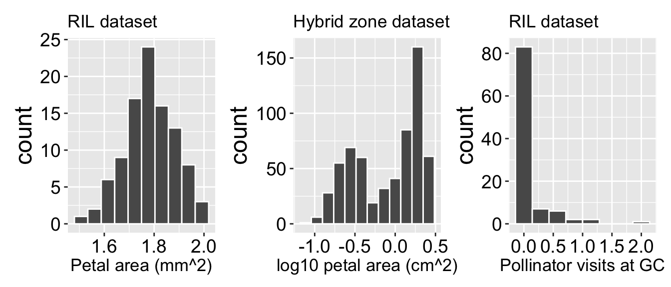
Distributions of select traits in Clarkia datasets. This figure shows histograms of three different variables from two datasets: Recombinant Inbred Line (RIL) populations and a hybrid zone dataset. The left panel displays the distribution of petal area (log10 mm^2) in the RIL dataset, showing a unimodal distribution. The middle panel presents the log10-transformed petal area (log10 cm^2) in the hybrid zone dataset, which appears bimodal. The right panel illustrates the number of pollinator visits at GC in the RIL dataset, showing a highly right-skewed distribution with many zero observations.
.
We hear and say the word, “Average”, often. What do we mean when we say it? “Average” is an imprecise term for a middle or typical value.
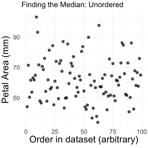
Figure 1: Step-by-step process of finding the median petal area in parviflora RILs. The animation begins with unordered petal area measurements plotted against their dataset order. The values are then sorted in increasing order, and a vertical dashed line appears at the middle value, marking the median. The median is highlighted, illustrating how it divides the dataset into two equal halves.
There are many ways to describe the center of a dataset, but we can broadly divide them into two categories – “nonparametric” or “parametric”. We will first show these summaries for petal area in our parviflora RILS, then compare them for numerous traits in these RILs.
Nonparametric summaries
Nonparametric summaries describe the data as it is, without assuming an underlying probability model that generated it. The most common non-parametric summaries of center are:
Median: The middle observation, which is found by sorting data from smallest to biggest (Shown visually in Figure 1).
Selecting the value of the \(\frac{n+1}{2}^{th}\) value if there are an odd number of observations,
Selecting the average of the \(\frac{n}{2}^{th}\) and \(\frac{(n+2)}{2}^{th}\) observations if there are an even number of observations.
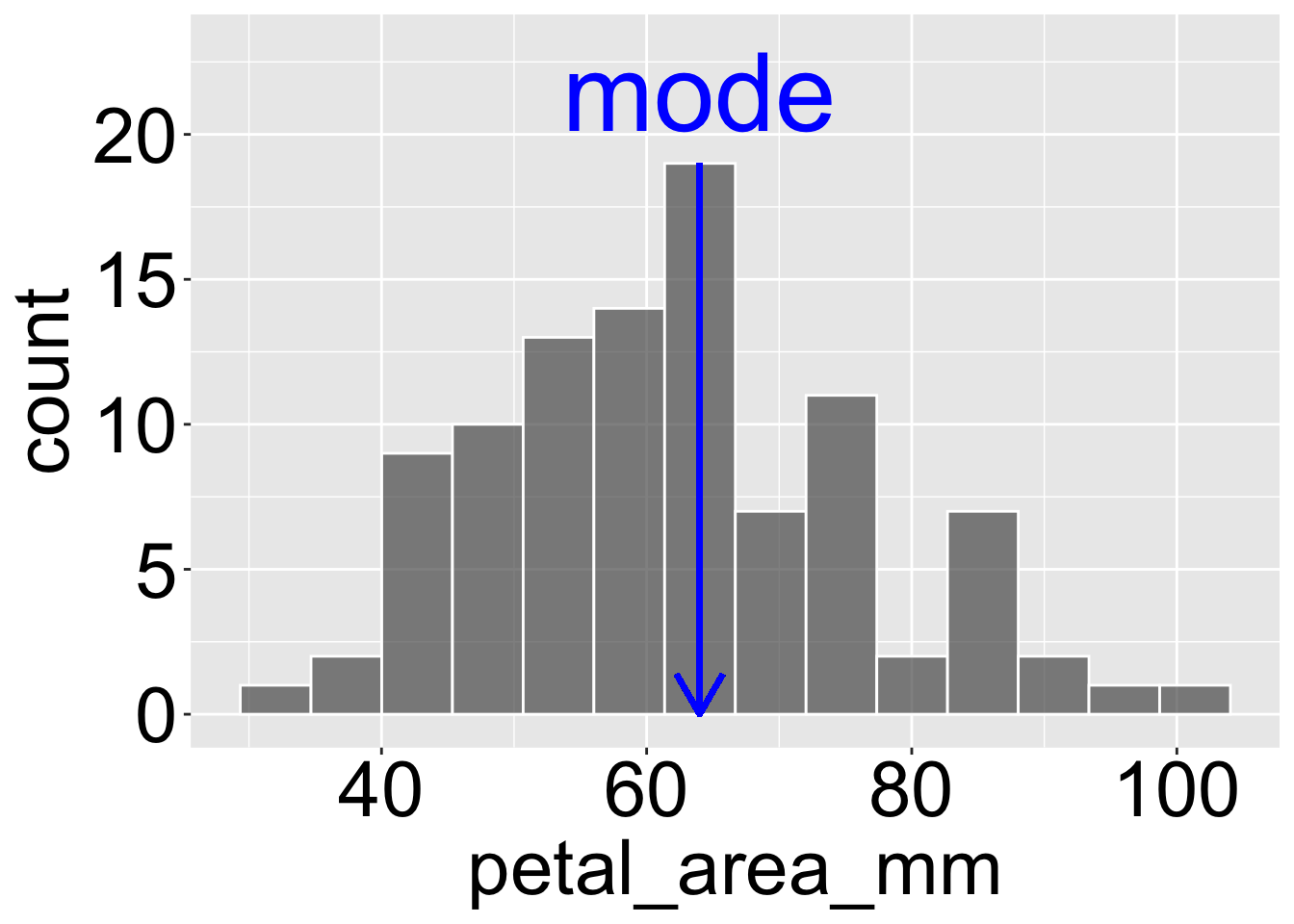
Figure 2: Illustration of the mode in petal areas of parviflora RILs. The histogram displays the distribution of petal area (mm), with the mode marked by a blue vertical line and labeled in blue text. The mode represents the most frequently occurring value in the dataset, corresponding to the tallest bar in the histogram.
Mode(s): The most common observation(s) or observation bin (Figure 2).
When reporting the mode, make sure your bin size is appropriate so as to make this a meaningful summary.
Communicating the modes is particularly important bimodal and multimodal data.
Parametric summaries
Parametric summaries describe the data in a way that aligns with a probability model (often the normal distribution), allowing us to generalize beyond the observed data.
Mean: The mean is the most common description of central tendency, and is known as the expected value or the weight of the data.
We find this by adding up all values and dividing by the sample size. In math notation the mean, \(\overline{X} = \frac{\Sigma x_i}{n}\), where \(\Sigma\) means that we sum over the first \(i = 1\), second \(i = 2\) … up until the \(n^{th}\) observation of \(x\), \(x_n\). and divide by \(n\), where \(n\) is the size of our sample. Remember this size does not count missing values.
Revisiting our examples above, we get the following simple summaries of mean and median. To do so, I type something like the code below (with elaborations for prettier formatting etc).
But remember mean and/or median may not be the best ways to summarize the center of either data set.
Means are best when data are roughly symmetric and plausibly generated by a well-understood distribution. Parametric summaries like the mean integrate easily with most statistical methods, and in many cases, the mean, median, and mode are roughly equivalent.
Medians are most appropriate when data are skewed. A classic example is income data—if Bill Gates walks into a room, the mean wealth increases dramatically, but the typical person in the room does not become wealthier. The median, which is less affected by extreme values, provides a more representative summary in such cases.
Modal peaks are most appropriate when data have multiple peaks (modes) or a large, dominant peak, the mode is often the most relevant measure of central tendency. For example, in our investigation of petal area in a Clarkia hybrid zone, the mean and median of log₁₀ petal area (cm²) were both close to zero (which corresponds to 1 cm²). However, this value falls in the trough between two peaks in the histogram—one corresponding to Clarkia xantiana xantiana and another to Clarkia xantiana parviflora. This means that neither the mean nor the median represents an actual plant particularly well, and the modal peaks give a clearer picture of what values are most typical.
Use-full but used-less summaries
Below are a few additional, useful but less commonly used, summaries of central tendency. It is good to know these exist. If this material is too slow / easy. for you, I recommend using your study time to familiarize yourself with these useful summaries, but otherwise don’t worry about them.
These assume that you are modelling these non-linear processes on a linear scale. You can decide if transformation or a more relevant summary statistics on a linear scale is more effective for your specific goal.
Harmonic mean – Is the reciprocal of the mean of reciprocals. Useful when averaging rates, ratios, or speeds. Unlike the arithmetic mean, which sums values, the harmonic mean gives more weight to smaller values and is particularly useful when values are reciprocals of meaningful quantities. For example in my field population genetics, the harmonic mean is used to calculate effective population size (\(N_e\)), as small population sizes have a disproportionate effect on genetic drift.
Mathematical calculation of the harmonic mean: The harmonic mean of a vector x is = \(\frac{1}{\text{mean}(\frac{1}{x})}\) = \(\frac{n}{\sum_{i=1}^{n} \frac{1}{x_i}}\).
Harmonic mean in R: You can find the harmonic mean as: 1/(mean(1/x)), or use the Hmean() function in the DescTools package. Watch out for zeros!!
Geometric mean - Is the \(n^{th}\) root of the product of \(n\) observations. The geometric mean is a useful summary of multiplicative or exponential processes For example: (1) Bacterial growth: If a bacterial population doubles in size daily, the geometric mean correctly summarizes growth trends, and (2) pH values in chemistry: Since pH is logarithmic, the geometric mean is a better measure than the arithmetic mean.
Mathematical calculation of the geometric mean: The geometric mean of a vector x is \(\left( \prod_{i=1}^{n} x_i \right)^{\frac{1}{n}}\), where \(\prod\) is the the “cumulative”product operator” i.e. the cumulative product of all observations.
Geometric mean in R: You can find the geometric mean as: prod(x)^(1/sum(!is.na(x))), or use the Gmean() function in the DescTools package. Watch out for negative values as they make this kind of meaningless.
Trimmed mean – A robust version of the mean that reduces the influence of extreme values by removing a fixed percentage of the smallest and largest observations before calculating the average. A 10% trimmed mean, for example, removes the lowest 10% and highest 10% of values before computing the mean. This is useful when extreme values may distort the mean but full exclusion of outliers isn’t justified (e.g., summarizing body weights where a few exceptionally large or small individuals exist).
Trimmed mean in R: You can find the trimmed mean yourself or by using the trimmed_mean() function in the in the r2spss package.